In this article, we will see how to create a grouped bar chart and stacked chart using multiple columns of a pandas dataframe
Here are the steps that we will follow in this article to build this multiple column bar chart using seaborn and pandas plot function
- Create a test dataframe
- Build a grouped bar chart using pandas plot function
- Create a pivot table to create a stacked bar chart
- Build a multiple column bar chart using seaborn
Create a dataframePermalink
We will first create a test dataframe with monetary details for an year. It has got four columns - month, sales, tax and profit.
df=pd.DataFrame(
                {'month':
                         ['jan', 'feb',
                          'mar', 'apr',
                          'may', 'jun',
                          'jul', 'aug',
                          'sep', 'oct',
                          'nov', 'dec'],
              'sales': [45, 13, 28, 32,
                        40, 39, 26, 35,
                        22, 18, 42, 30],
              'tax': [5, 2, 4, 6, 8, 7,
                           3, 5, 3, 2, 10, 6],
              'profit': [40, 11, 24, 26, 32, 32,
                         23, 30, 32, 20, 8, 36]})

df
This is how our test dataframe looks like:
| Month | Sales | Tax | Profit | |
|---|---|---|---|---|
| 0 | jan | 45 | 5 | 40 |
| 1 | feb | 13 | 2 | 11 |
| 2 | mar | 28 | 4 | 24 |
| 3 | apr | 32 | 6 | 26 |
| 4 | may | 40 | 8 | 32 |
| 5 | jun | 39 | 7 | 32 |
| 6 | jul | 26 | 3 | 23 |
| 7 | aug | 35 | 5 | 30 |
| 8 | sep | 22 | 3 | 32 |
| 9 | oct | 18 | 2 | 20 |
| 10 | nov | 42 | 10 | 8 |
| 11 | dec | 30 | 6 | 36 |
Create a grouped bar chat with multiple columnsPermalink
Pandas plot:Permalink
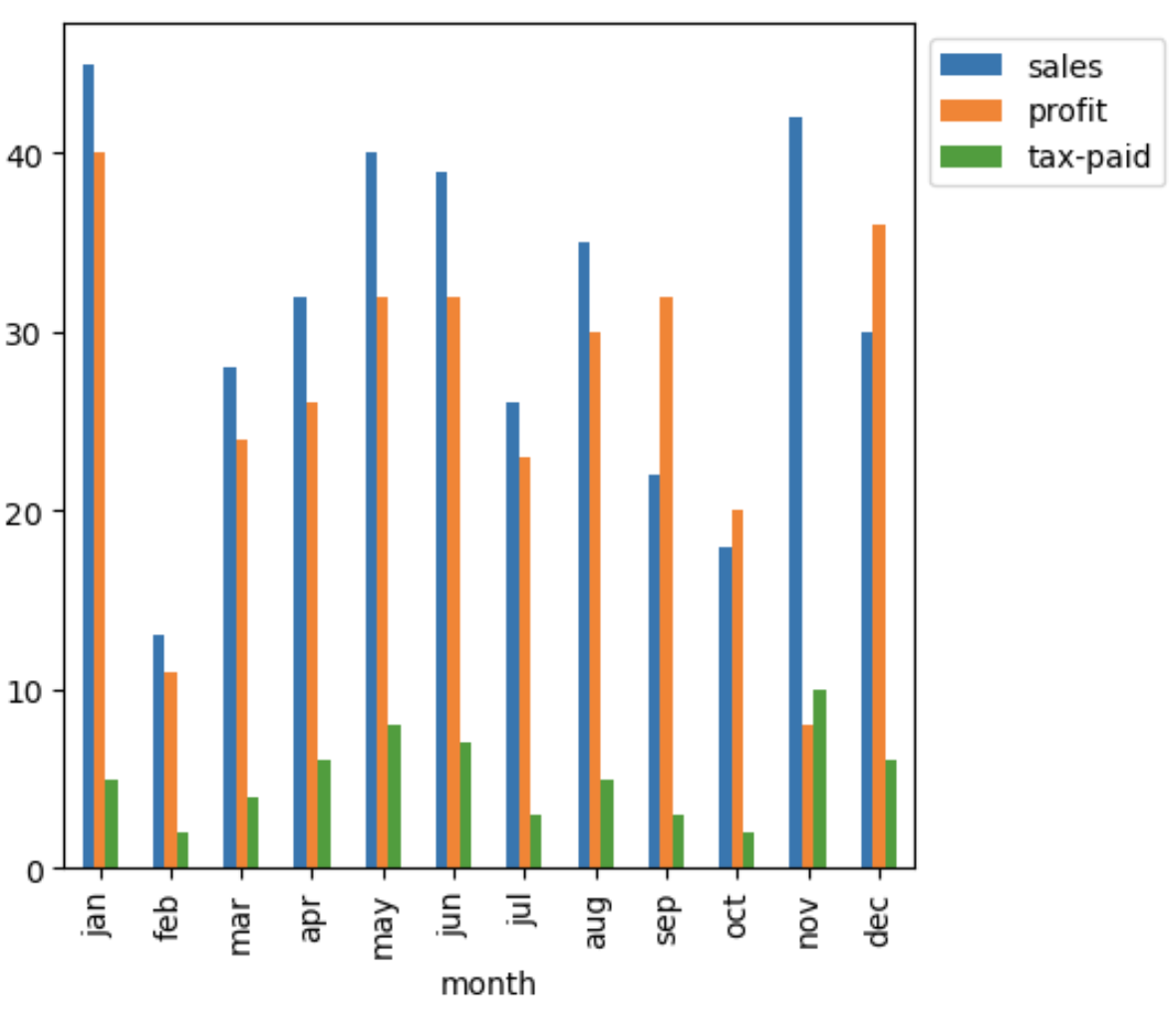
We will use pandas plot function and pass month column as x parameter and all other columns as list to y parameter
(df.plot(
        x='month',
        y=['sales','profit', 'tax-paid'],
        kind='bar',
        figsize=(5,5))
        .legend( bbox_to_anchor =(1 ,1)
       )
)
Horizontal bar plot:
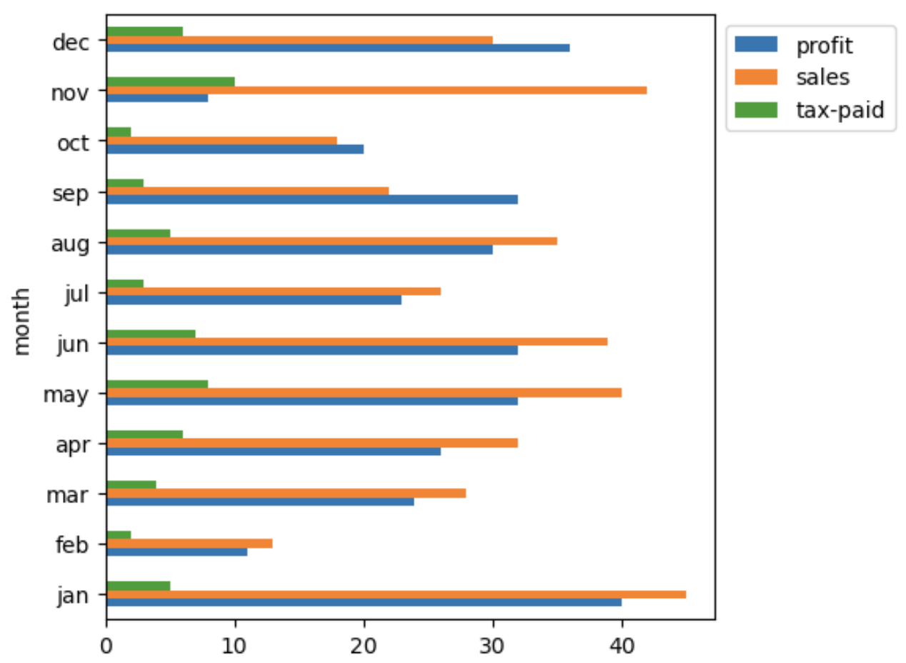
Update the kind parameter to barh to create a horizontal bar chart
(df.plot(
          x='month',
          y=['sales','profit', 'tax-paid'],
          kind='barh',
          figsize=(5,5))
        .legend( bbox_to_anchor =(1 ,1)
       )
)
Pivot table plot:Permalink
We could also create the grouped bar chart with multiple columns by first creating a pivot table from the dataframe and then plot it
(
  pd.pivot_table(
               df,
               index=['month'],
               sort=False)
              .plot(kind='bar',
                    figsize=(5,5))
              .legend( bbox_to_anchor =(1 ,1)
               )
)
Create a stacked bar chatPermalink
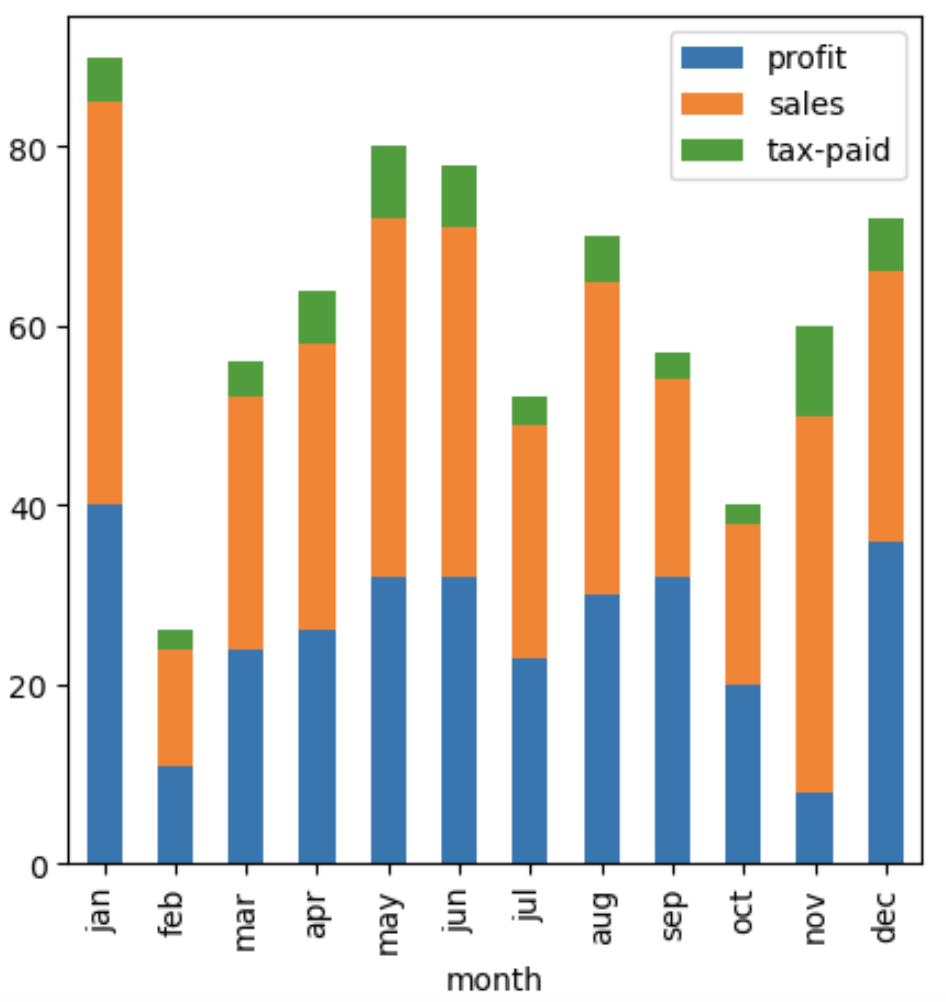
Just in case, you would like to plot the stacked bar chart of all those columns instead of a grouped bar chart, we could just add a stacked parameter in the pandas plot function to built it
(
  pd.pivot_table(
               df,
               index=['month'],
               sort=False)
              .plot(kind='bar',
                    figsize=(5,5),
                    stacked = True)
              .legend( bbox_to_anchor =(1 ,1)
               )
)

#OR

(
  df.plot(
          x='month',
          y=['sales','profit', 'tax-paid'],
          kind='bar',
          figsize=(5,5),
          stacked=True)
        .legend( bbox_to_anchor =(1 ,1)
         )
)
Create a grouped bar chat using seabornPermalink
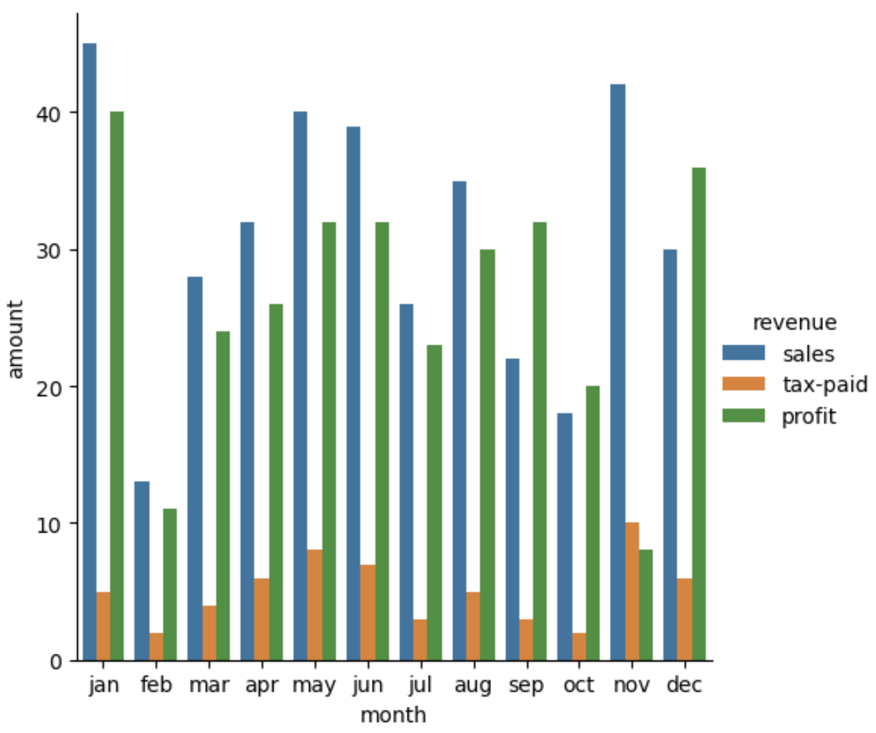
Seaborn provides some easy to plot grouped bar charts functions, we need to first reshape the dataframe and melt it so that we have a dataframe in long format as shown here
df1=pd.melt(
            df,
            id_vars="month",
            var_name="revenue",
            value_name="amount"
      )
df1
| Month | Accounts_category | Amount | |
|---|---|---|---|
| 0 | jan | sales | 45 |
| 1 | jan | tax-paid | 5 |
| 2 | jan | profit | 40 |
| 3 | feb | sales | 13 |
| 4 | feb | tax-paid | 2 |
| 5 | feb | profit | 11 |
| 6 | mar | sales | 28 |
| 7 | mar | tax-paid | 4 |
| 8 | mar | profit | 24 |
| … | … | … | … |
To plot a grouped bar chart, we could use either seaborn barplot or catplot
fig, ax = plt.subplots(figsize=(8, 8), dpi=100)

sns.barplot(
              x='month',
              y='amount',
              hue='revenue',
              data=df1,
              ax=ax
            )

# OR

sns.catplot(
            x='month',
            y='amount',
            hue='revenue',
            data=df1,
            kind='bar'
          )






No comments:
Post a Comment