One of the most popular plotting libraries in R is not the plotting function in R base, but the ggplot2 library. People use that because it is flexible. This library also works using the philosophy of “grammar of graphics”, which is not to generate a visualization upon a function call, but to define what should be in the plot, and you can refine it further before setting it into a picture. In this post, you will learn about ggplot2 and see some examples. In particular, you will learn:
- How to make use of ggplot2 to create a plot from a dataset
- How to create various charts and graphics with multiple facades using ggplot2
Let’s get started.
Overview
This post is divided into two parts; they are:
- Getting Started with ggplot2
- Examples of Plots with ggplot2
Getting Started with ggplot2
You need to install ggplot2 in your R environment with the following:
Once you have it installed, you need to load it to use its features:
An example of ggplot2 would be to load a simple dataset such as the iris classification dataset and make a plot:
This is to first create a plot object with the dataset iris. But this would be a clean slate. Then you want to add a scatter plot on the canvas, namely, the points as separate dots. This is done by adding geom_point() onto the ggplot object and using aes() to specify the coordinate and color of each point.
The output of this plot would be as follows:
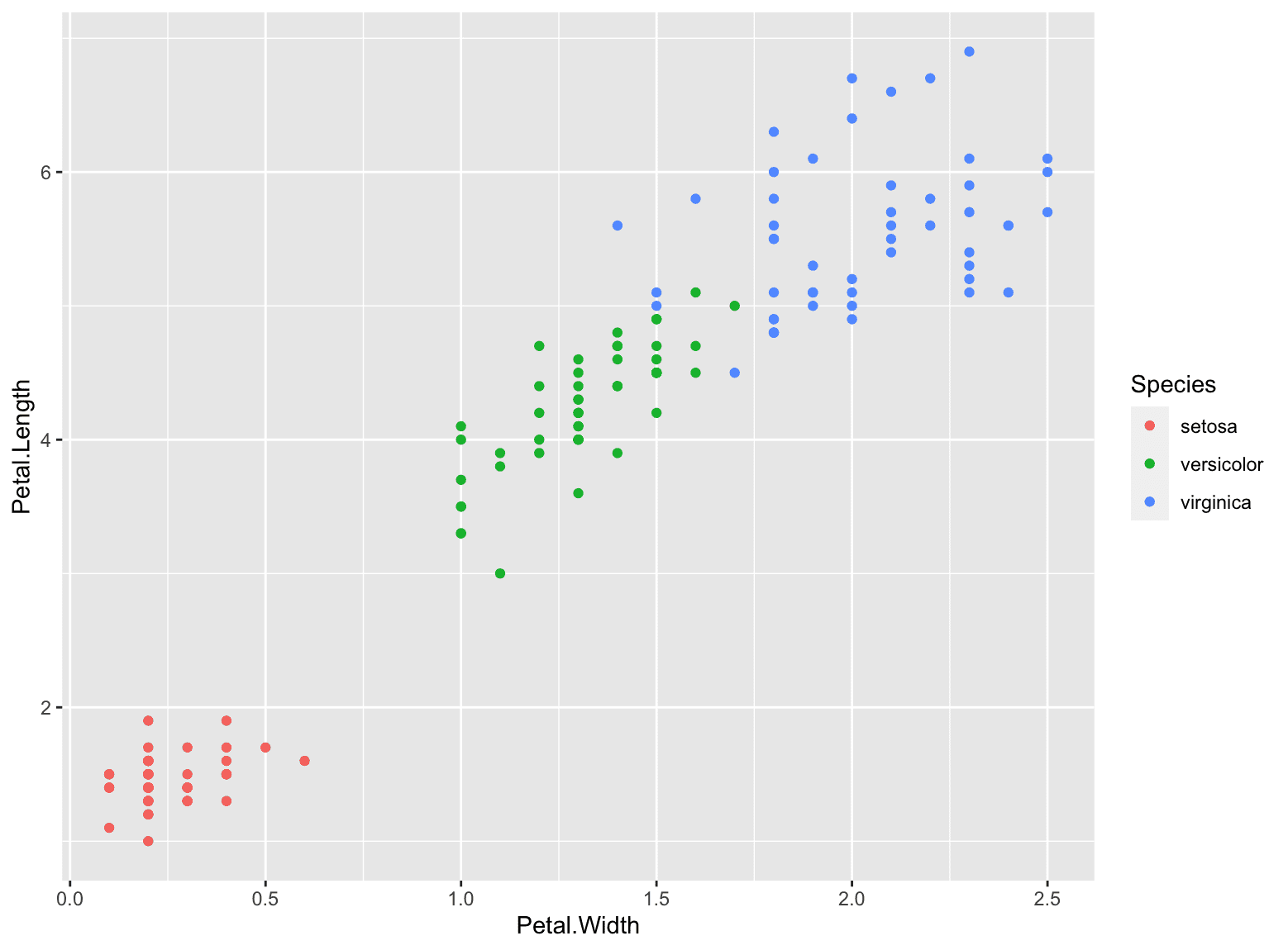
This is indeed a plot object that you can assign to a variable. To show the idea of the grammar of graphics, you should notice the two axes are labeled after the column name, and you can add a modifier to the axes label as well as the theme:
This will give you a slightly different picture:
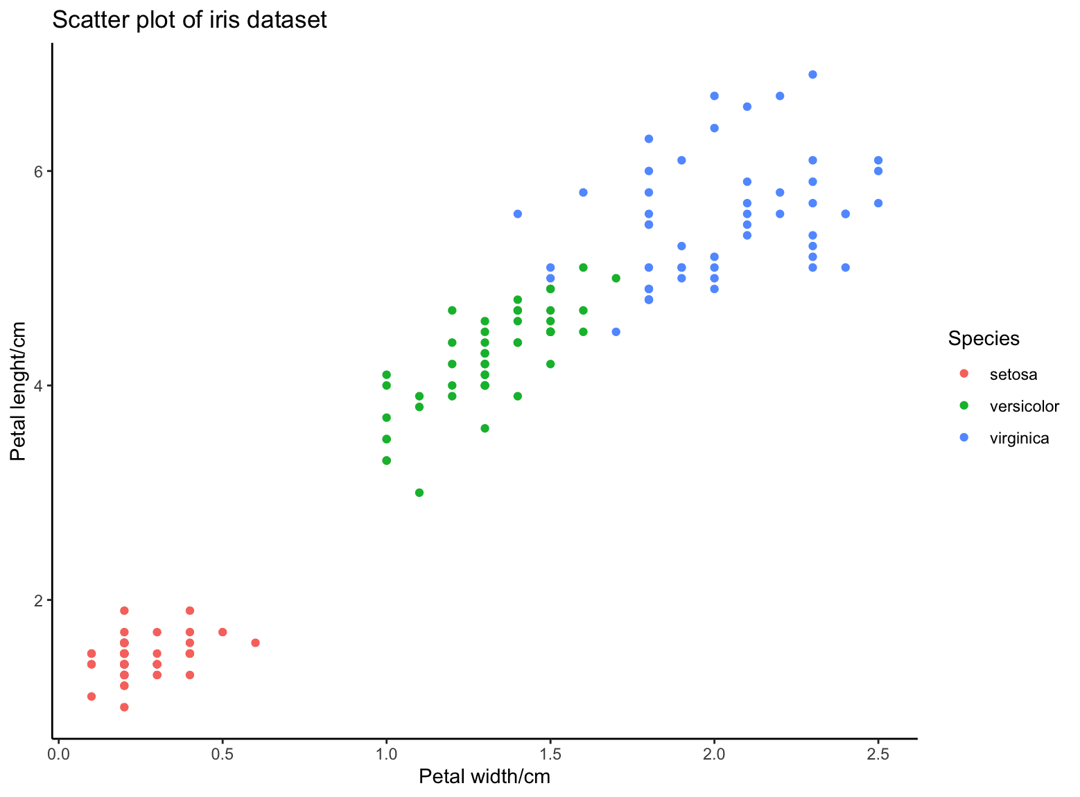
If you want to overlay different plot or change some style in the picture, all you need to do is to add the modifier function to the graph object.
Examples of Plots with ggplot2
Let’s see some more examples with ggplot2.
Let’s consider the mtcars dataset in the following. The dataset is like the following:
This dataset has only 32 rows and each row has 11 attributes. Let’s consider only the column mpg and below is how we create a histogram and a density plot:
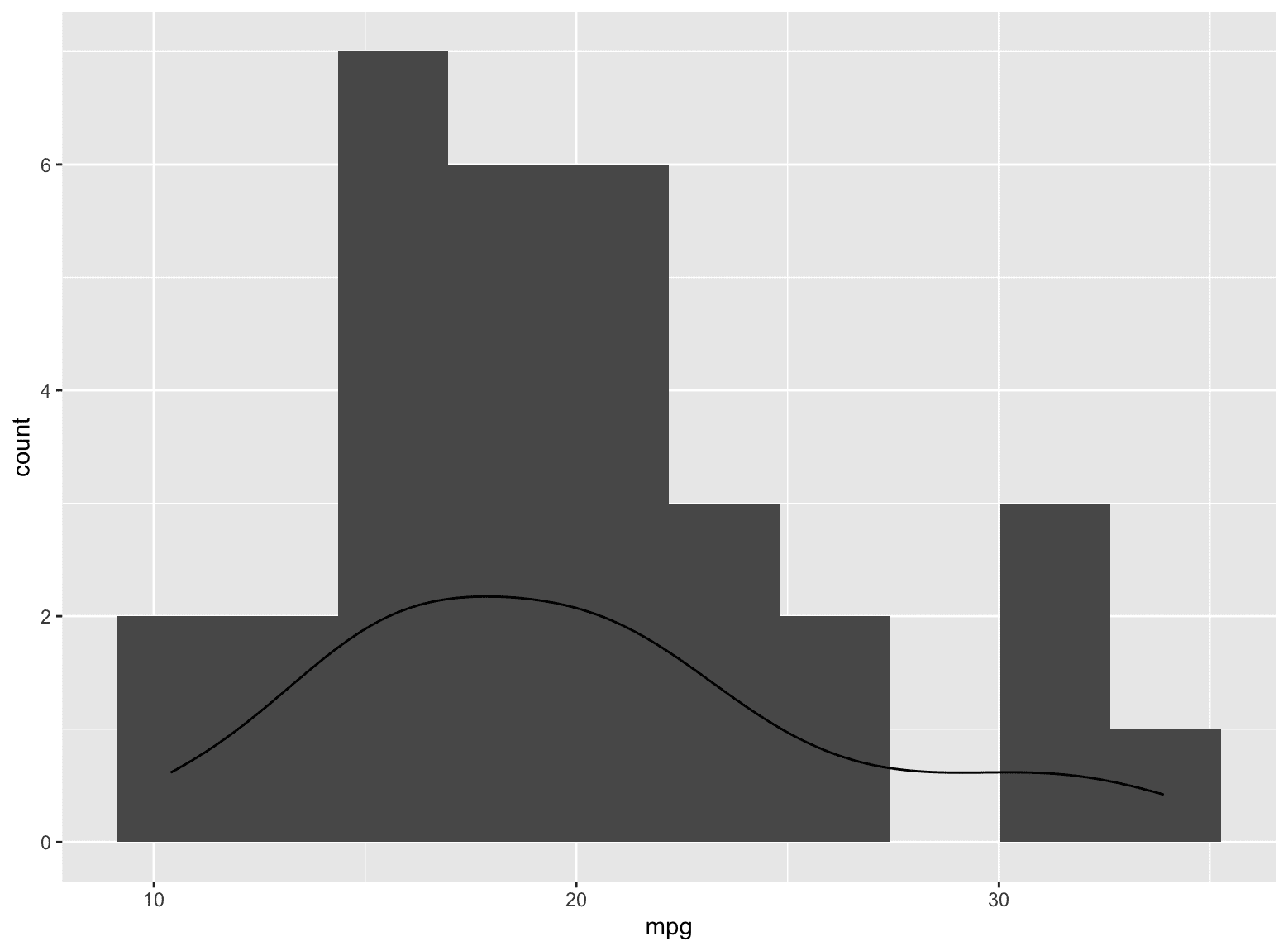
Here you see how you can make two different plots overlap on the same chart. Another example that you may find it useful is to overlap a scatter plot with a linear regression:
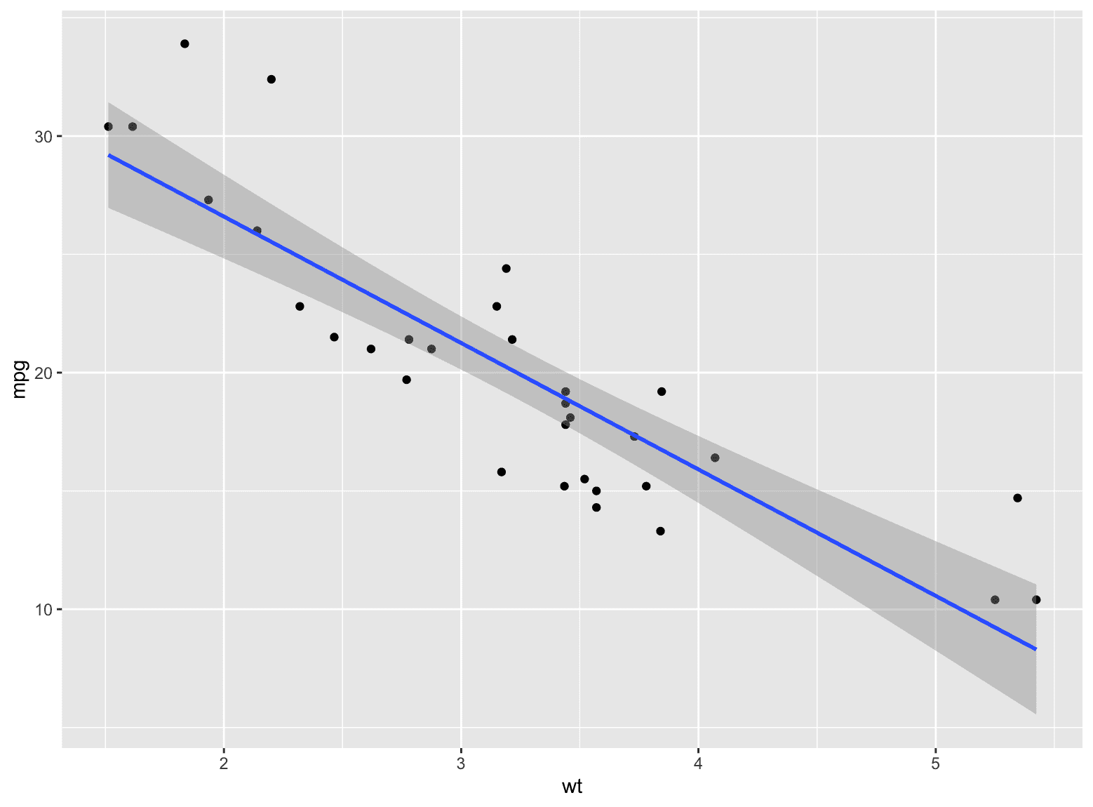
You defined a ggplot object with the x- and y-axes specified. Then draw the points and draw the smoothed line. Beware that you need to use method=lm in geom_smooth() for a straight line. By default, it will be equivalent to method=loess which will be a curve generated using locally estimated scatterplot smoothing algorithm.
Sometimes, you would like to plot three different attributes. Instead of having a 3D plot, you may try a 2D plot with multiple facets if one of them is a categorical variable. Below is an example of plotting the attribute mpg against wt and separated by different values of cyl:
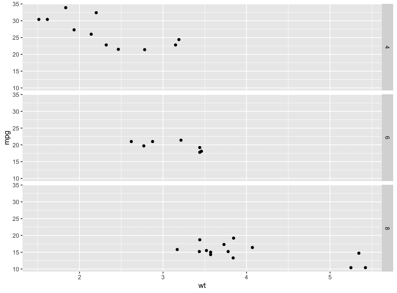
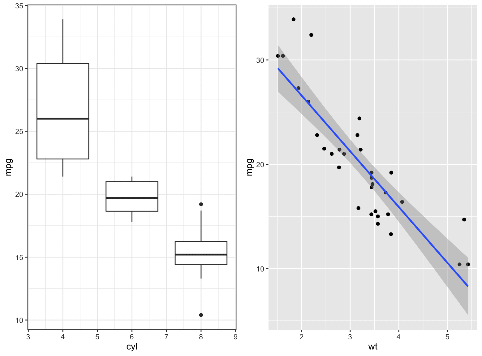
Note that you may choose to have column facets if you pass in a cols= parameter instead of rows= above. One downside of facets is that the plots must be of similar nature. If you want to put two different plots side by side with highest flexibility, you may want to look at the package cowplot:
This will produce a plot as follows:
Further Readings
This section provides you some links to study further on the materials above:
Books
- Beginning data science in R 4, second edition by Thomas Mailund
- R graphics cookbook, second edition, by Winston Chang
- The Grammar of Graphics, second edition, by Leland Wilkinson
Online materials
Summary
In this post, you learned about the library ggplot2 in R. In particular, you learned:
- How to create plots using the grammar of graphics
- How to create scatter plot, line plot, and histograms using ggplot2
- How to create multiple plots in the same graph






No comments:
Post a Comment